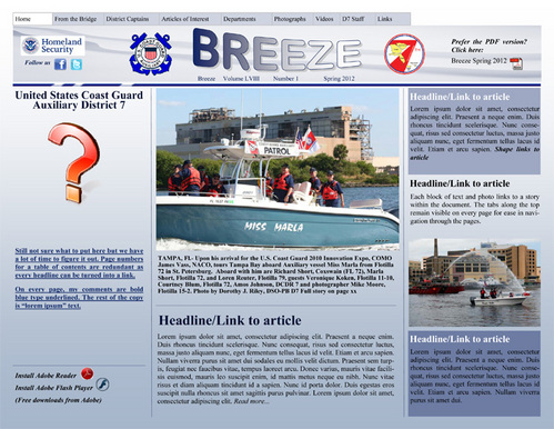
I think I mentioned that the Auxiliary stopped publishing a printed copy of our news magazine and wants to move to a web-based format. The first step was to create a mock-up of the new format. I followed the layout of electronic newspapers such as the New York Times and the Washington Post. There are tabs/links along the top and the individual headlines that will link to articles of interest. This is purely a mock-up. I used photos that I took and "lorem ipsum" text to get a feel for how the various page elements will work together.
I am still learning the software and not ready to build this complicated page set-up in Design Premium. I just needed a guide for when I am ready. I needed a 'vision' of what to build.
That question mark along the left edge- I am not sure what to put there yet.
Why do I think this lacks the pizazz of a printed copy? I think because there is no "wow" factor.


