


An Analysis of the Dow Jones Industrials
Index, plus the S&P500, Gold and Silver
Index, plus the S&P500, Gold and Silver
Clive Maund
The
recent dramatic plunge by the bond market, signalling higher interest
rates to come, naturally swivels the spotlight onto the stockmarket,
for rising interest rates are to the stockmarket what green kryptonite
is to Superman - to put it mildly, somewhat debilitating. Over the past
year or so the administration and the Fed have gone to truly
extraordinary lengths to buttress the stockmarket and maintain the
illusion that an economic recovery is just around the corner. The
measures employed have included dropping interest rates to the floor,
an incessant barrage of upbeat propaganda from the syndicated media and
outright manipulation of the markets, and so far, they have gotten away
with it - succeeded in creating the desired effect. The stockmarket has
hung in there, and even staged an impressive rally of over 1500 points
on the DJIA since March. They are much more concerned about propping up
the stockmarket than the bond market, as a falling stockmarket sours
the mood of the voting masses far more than a falling bond market does,
not least because of the effect on their pension schemes. While the
mainstream media have been relentlessly trumpeting the virtues of the
stockmarket, the truly great and the good in the world of financial
forecasting, especially in the precious metals arena, have been
attempting to warn people of the dangers, and have amplified these
warnings greatly these past weeks following the bond market plunge,
with a number predicting a market crash. With the recent dramatic
developments in the bond market and their implications for interest
rates, and October being only two months away, I thought it would be
timely to make an analysis of the Dow Jones index chart. We will look
at three charts of this index, starting with a one-year chart, then a
ten-year, and finally a chart of over 30 years duration. This is a
reversal of my usual way, which is to zoom in, rather than to zoom out,
but the reason for doing this will soon be clear.
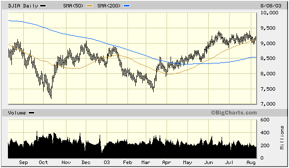
Beginning with the one-year chart, the first
thing to note is that a good many investors do not look at a chart
going back further than this. I have deliberately refrained from
drawing anything on this chart in order to avoid giving the game away.
Doesn't look too bad does it? - I'd even say it looks pretty good with
the recent advance to a one-year high and the 200-day moving average
turning up. Just on the basis of this chart one might be tempted to buy
on a reaction back to around 8600. Getting in the mood? - well don't,
because we're moving right on to the 10-year chart, which I'm sorry to
say is a bit of a party pooper.
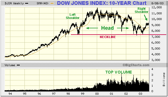
Looking at the 10-year chart I'm sure you'll see
the resemblance between this profile and a side on view of the
Himalayas. There is an awful lot of resistance above, isn't there?
Think of all the countless thousands of hapless investors who bought
from 1999 through 2002, with the Dow between 10,000 and 11,000, waiting
patiently to "get out even" or as near to even as they can if the index
gets within sniffing distance of 10,000. Our maximum probable upside is
thus established at 10,000. We are now at 9191, so our probable maximum
gain on this index is about 800 points or less than 10%. Now to figure
the possible downside, which will be greatly facilitated by looking at
a chart very few investors get to see, a chart going way back to 1970.
Make sure you're sat down before you look at this one.
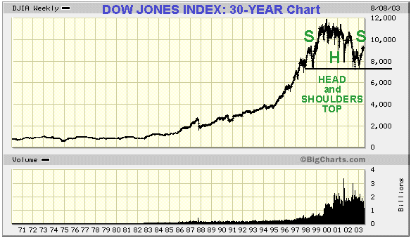
There's really not much need to write a lot about
this chart. It should be manifestly obvious that what we are looking at
is a gigantic bubble top, with a corresponding explosion in trading
volume. This top has taken the form of a massive Head-and-Shoulders,
and we appear to be sat right on the top of the right shoulder of this
formation at the time of writing.
So what is the downside? Using a log chart we
measure from the top of the head of this formation down to the
neckline, and project an equal distance on the chart below the
neckline, to arrive at a MINIMUM downside objective, but this being a
minimum, I would describe the downside as unlimited.
This is a quiet time of year and many market
participants are on holiday, so I would expect the market to take its
time to complete the right shoulder and then to drift lazily down
towards the neckline in the low 7000's in coming weeks, probably as the
bond market unwinds its short-term oversold condition. As I have
indicated earlier, it may advance a few hundred points more in coming
weeks towards 10,000, although I regard this as unlikely as it would
result in an irregular pattern. Once 7000 is breached a panic selloff
is on the cards.
So there you have it, in my view a maximum 800
points or 10% upside versus virtually unlimited downside, I will leave
you, dear reader, to decide which way you want to play it.
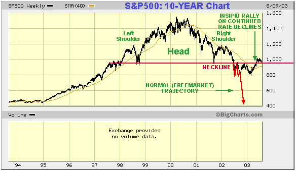
Before closing let's take a quick look at the
10-year chart for the S&P500, which is, after all, considerably
more significant than the DJIA. There is a big difference between the
S&P and the DJIA charts, and that is that the S&P completed the
right shoulder of its famous head-and-shoulders formation over a year
ago, and broke down way below its neckline, this fall coinciding with a
drop by the DJIA to its neckline. Without heavy intervention and
manipulation we should have plunged at that point, and the necessary
purging of the excesses in the economy would have got underway in
earnest. But instead, interest rates have been forced down into the
basement, fuelling bond and real estate booms which are now abruptly
terminating, and stocks have been propped up by means of massive back
door purchases while gargantuan debts have piled up and all that has
resulted is a rally that, on these charts, looks anaemic and doomed.
This interference and obstruction of natural and necessary corrective
processes will have far worse consequences going forward than if they
had simply stood back and let the markets take their natural course.
It's like taking someone who has run a marathon and pumping them full
of stimulants and getting them to do another ten miles. It is
interesting to observe how the S&P index has crept above the
neckline of its head-and-shoulders formation, leading many people to
believe that the pattern has aborted and is invalid. Given that "they"
doubtless employ Technical Analysts it's very possible that they
engineered this move. That giant head-and-shoulders pattern is a sign
of massive distribution, and I regard the move above the neckline as a
cruel deceiving move, which is going to cost those people who were
taken in by it dearly.
As many of my readers know, I am a cheerful,
optimistic fellow at heart, and so it would be churlish of me to end
this article on a negative note. Every cloud has a gold or silver
lining, and gold and silver, and gold and silver stocks, are set to
rocket. Gold and silver stocks rallied strongly late last week, which
indicates to me that the metals themselves are about to take off. The
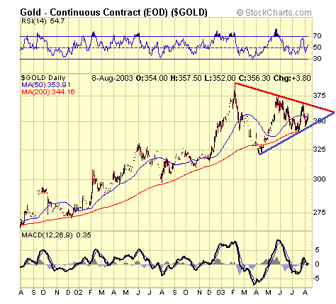
two-year chart for gold, below, shows gold wound up like a coiled
spring towards the apex of a symmetrical triangle that has been going
on all year. I expect it to bust out of this shortly and vault above
$400. If this happens, then notwithstanding the impressive rises in the
stocks over the past couple of weeks, they could well put in a quite
spectacular performance in the time ahead. It is true that if we have a
crash phase in the general stockmarket, then metals stocks may get
caught up briefly in the general melee, and we'll need to watch out for
that, but that may be up to a couple of months away yet, and a lot can
happen (on the upside) to the metals stocks during this intervening
period.
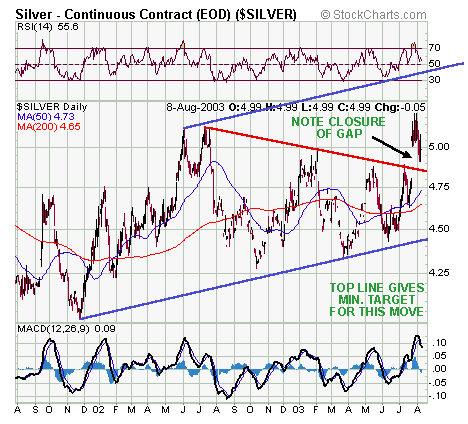
Likewise silver, which broke out of its one-year
long symmetrical triangle pattern two weeks ago with a big gap move,
and has since reacted back to test support, is now set to advance
swiftly to $5.50 minimum, to the line parallel to the bottom line of
the triangle in the two-year chart below, in coming weeks.
Dow Jones Industrials Index - closed at 9191 on 8th August 2003
S&P500 - closed at 977.59
Gold Bullion Spot - closed at $356.30
Silver Bullion Continuous Contract - closed at $4.99
Clive Maund, Diploma Technical Analysis
clive.maund@t-online.de
www.clivemaund.com
Kaufbeuren, Germany, 9th August 2003
No responsibility can be accepted for losses that may result as a consequence of trading on the basis of this analysis.